The rise of digital humanities suggests the need to rethink some basic questions in quantitative history. Why, for example, should historians use regression analysis? The conventional answer is simple: regression analysis is a social science tool, and historians should use it to do social science history. But that is a limited and constraining answer. If the digital humanities can use quantitative tools such as LDA to complement the close reading of texts, shouldn’t we also have the humanistic use of regression analysis?
What I would like to suggest is idea of model building as a complementary tool in humanistic history, enhancing rather than replacing conventional forms of research. Such an approach rejects what we might call the Time on the Cross paradigm. That approach holds that econometric models are superior to other forms of analysis, and that while qualitative sources might be used to pose questions, on quantitative sources can be used to answer questions. But what if the opposite is true? What if model building can be used to raise questions, which are then answered through texts, or even through archival research?
Let me anchor these ideas in an example: an analysis of the 2012 US News and World report data for college admissions and endowments. Now in a classical social-science history approach, we would first need to posit an explicit hypothesis such as “selective admissions are a linear function of university endowments.” Ideally the hypothesis will involve a causal model, arguing, for example, that undergraduates apply to colleges based on perceived excellence, and that excellence is a result of wealth. Or we might cynically argue that students simply apply to famous schools, and that large endowments increase the applicant pool without any relationship to educational excellence. But humanistic inquiry is better served by an exploratory approach. In exploratory data analysis (EDA) we can start without any formal hypothesis. Instead, we can “get to know the data” and see whether interesting patterns emerge. Rather than proving or disproving a theory, we can treat quantitative data as we would another any other text, searching both for regularities, irregularities, and anomalies.
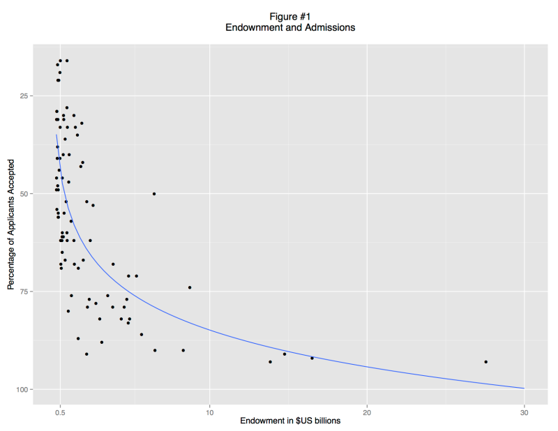
A basic scatterplot shows an apparent relationship between endowment and the admittance rate: richer schools accept a smaller percentage of their applicants (Figure 1). But the trend is non-linear: there is no limit to endowment, but schools cannot accept less than 0% of their applicants. This non-linearity is simply an artifact of convention. We can understand the data better if we re-express the acceptance rate as ratio of students rejected to students accepted and use a logarithmic scale (Figure 2). There is now a fairly clear trend relating large endowments and high undergraduate admittance rate: the data points track in a broad band from bottom left to top right. But there are also some clear outliers, and examining these leads to interesting insights.
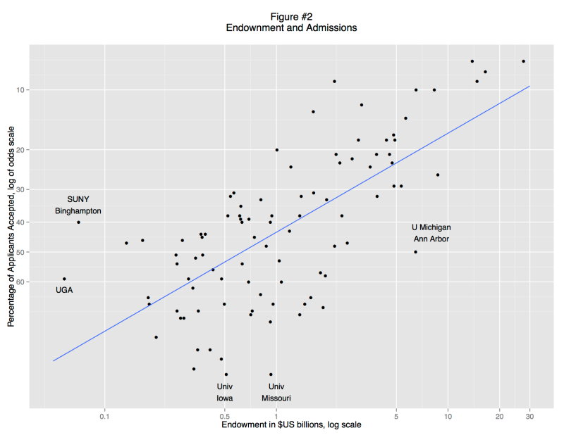
On the left, for example, we find three schools that are markedly more selective than other schools with similar endowments: SUNY College of Environmental Science and Forestry, the University of Georgia, and SUNY Binghamton. On the right is University of Michigan, Ann Arbor. At the bottom are the University of Missouri and University of Iowa. What do these schools have in common? They are all public institutions.
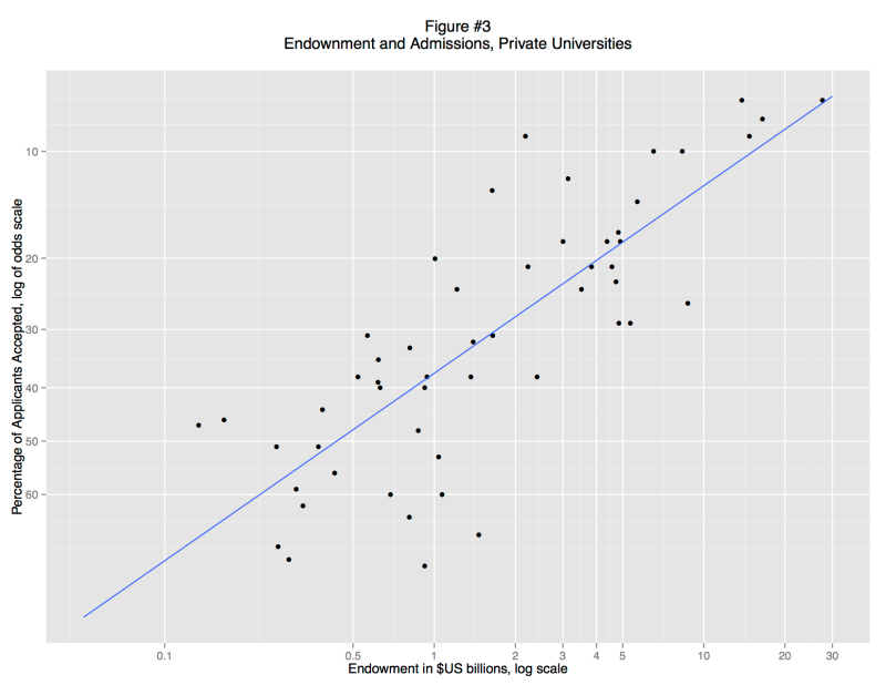
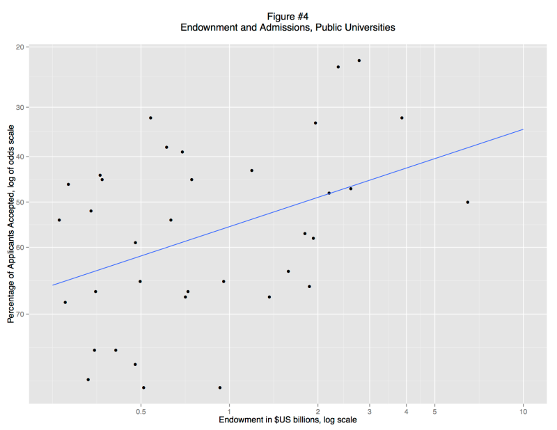
When we separate the private and public schools (Figures 3 and 4) it becomes clear that there is no general relationship between endowment and admittance rate. Instead, there is a strong association for private colleges, but almost none for public colleges. These associations are visual apparent: private school fall close to the trend line (a standard OLS regression line), but for public schools the data points form a random cloud. Why? Perhaps the mandate of many state schools is to serve a large number of instate students and that excessively restrictive admissions standards would violate that mandate. Perhaps the quality of undergraduate education is more closely linked to endowment at private schools, so applicants are making a rational decision. Or perhaps, private schools are simply more inclined to game their admittance rate statistics, using promotional materials to attract large numbers of applicants.
What’s striking here is that we no longer need the regression model. The distinction between public and private universities exists as a matter of law. The evidence supporting that distinction is massive and textual. Although we “discovered” this distinction through regression analysis, the details of the model are unnecessary to explain the research finding. In fact, the regression model is vastly underspecified, but that doesn’t matter. It was good enough to reveal that there are two types of university. In fact, the most important regression is the “failure”: the lack of a correlation between endowment and selectivity in public colleges.
So let us image a post-apocalyptic world in which the US university system has been destroyed by for-profit MOOCs and global warming: Harvard, Stanford, and Princeton are underwater both physically and financially, while Michigan Ann Arbor and UI Champaign-Urbana are software products from the media conglomerate Amazon-Fox-MSNBC-Google-Bertelsmann. An intrepid researcher runs a basic regression and discovers that there were once private and public universities. This is a major insight into the lost world of the early twenty-first century. But the research can responsibly present these results without any reference to regression, merely by citing the charters of the school. She might also note that the names of schools themselves are clues to their public-private status. Regression analysis does not supplant close reading, but merely leads our researcher to do close reading in new places.
What’s important here is that these models are, by social science standards, completely inadequate. If we were to seriously engage the question of how endowment drives selectivity we would need to take account of mutual causation: rich schools become selective, but selective schools become rich. That would require combining panel and time series data with some sort of structural model. But we actually don’t need anything that complicated if we are posing questions with models and answering them with qualitative data. In short, we can build a model, then throw it away.


 In an upcoming post, I’ll grab the raw data and post some “he/she” ratios, but this was too much fun not to share.
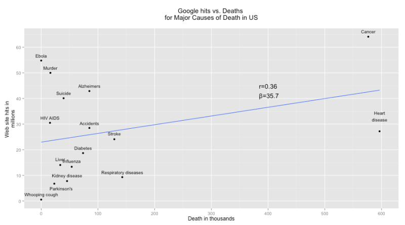 But that’s just an artifact of cancer and heart disease, which kill four times as many Americans as the “runner up,” respiratory diseases.


